FamILY
The Problem
Users require an organizational platform for family activities that accommodates various audiences including children, busy parents, and individuals with differing abilities.
Process
The design process incorporated competitive analysis and aggregated online user data to inform development decisions. AI productivity tools were leveraged for user research and competitive analysis.
Deliverables
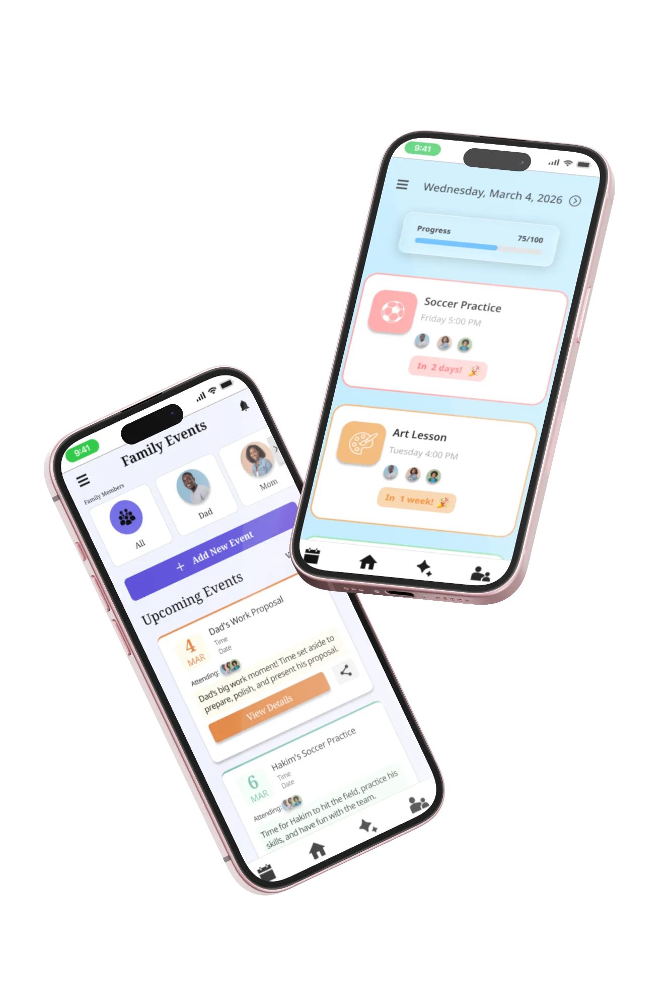
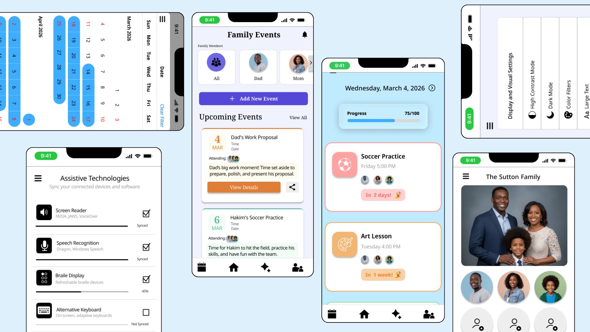
A simple, accessible, and collaborative way to plan with family through accessibility and importing tools that reduce planning burden for families with differing abilities.
UX Research
UX Research User research was conducted using competitive research and online user data. Online surveys, interviews, and reviews were necessary to understand what users need from the app and website that are unique to their needs considering this is a case study. Users needs and pain points are fully realized which makes it easier to build the design for its specific audiences. Before completing the research it seemed the design problem was an easy fix and it was simply necessary to build something simple and straightforward. Although a part of the users’ needs, there is so much more that is required to build a design that benefits everyone who might use it. Considering it is for the whole family’s schedules, it was an interesting assertion that the app should be child-friendly as well as easy for busy adults, and those with any accessibility needs.
Too busy to plan - Users expressed an issue with their schedules, causing difficulty in planning. The design will be able to add the users' planning platforms right into the app and plan for you, so it is as easy as clicking some buttons, not inputting lots of data. Easy-to-learn tools - Users struggle with the onboarding of new technologies, so these designs mimic what they already use, so they don’t need to learn how to use them. Not child-friendly - Users with younger children who may or may not use technology need to have access to the app or website. The design is child-friendly and easy for them to use as well. Navigation - Users with accessibility needs stressed the importance of designs that don’t have too many steps, too many words, or too many buttons. These designs are clear, visual, and have simple IA.
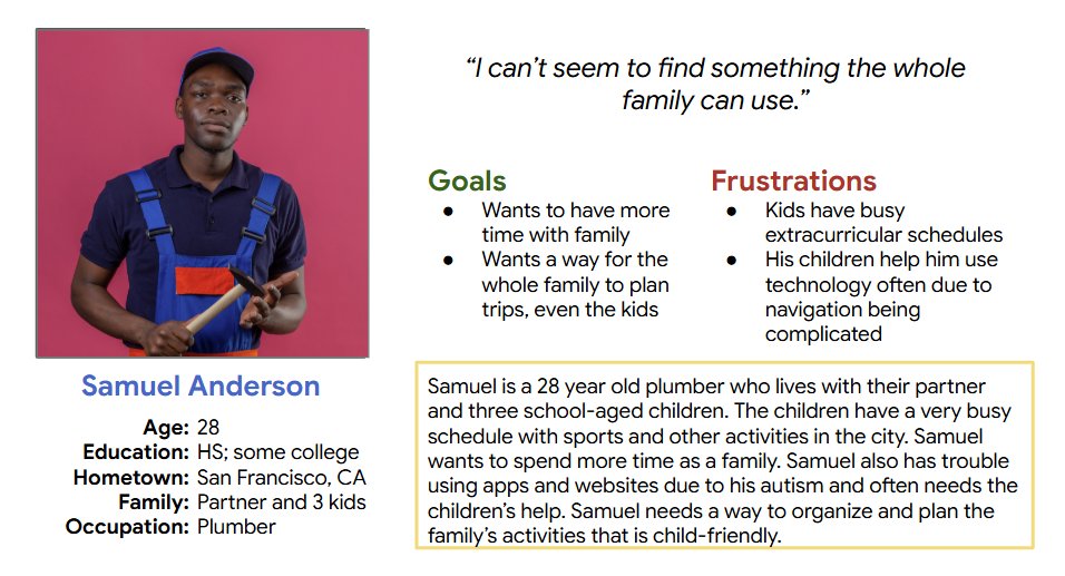
Personas
Digital Wireframes
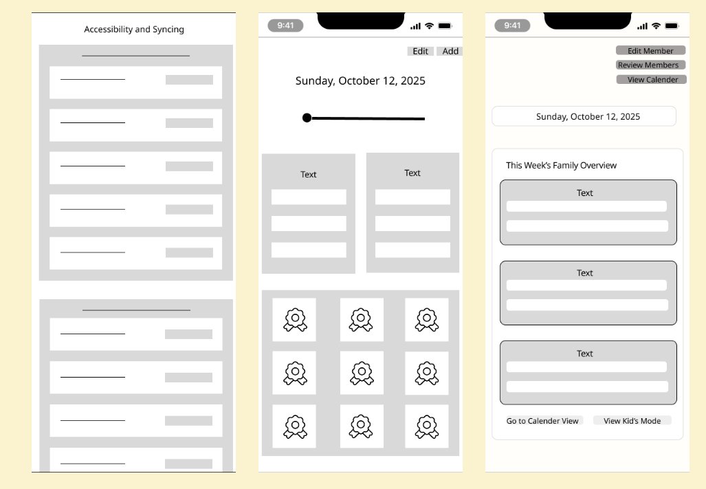
Early low and mid fidelity wireframes in the iterative design process. After a few rounds of ideation these designs were totally changed. These lo fi and mid fi wiredrames were just a starting point where users were able to give feedback on the apps rough sketch and effectiveness in solving user problems. The design's UI was also changed in the ideation phases due to aesthetic appeal and user preferences. The accessibility of the app's UI was consistently proritized to maintain the user's needs and considering accessibilty's benefit for all users.
Usability Studies
The "kids mode" page was changed many times. Users reported issues with the app's UI look and feel. The colors, placement, and style of the app were updated several times before the mockup stage. In the mockup stage, the home page view, for example, was also changed during usability findings. Overlays were added to pop-up menus to provide a better experience within app navigation.
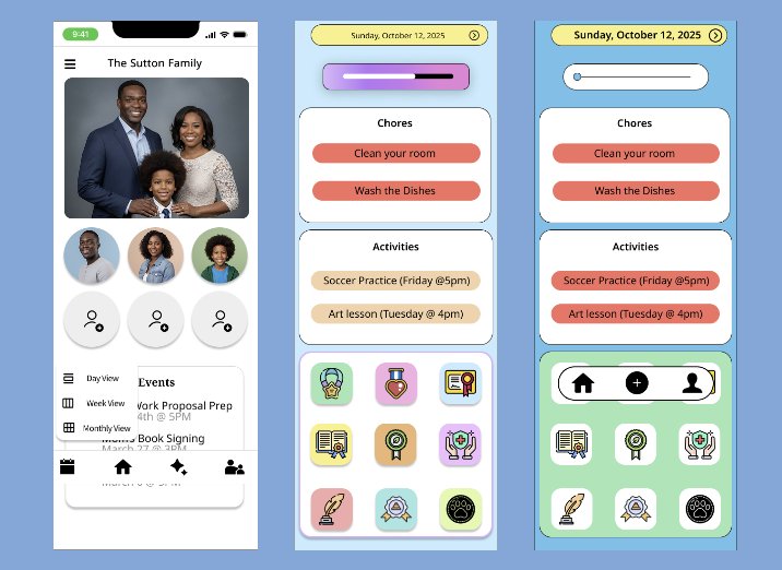
Usability Findings and Design Changes
Usability Findings - Users thought some text announcements were buttons based on their shape/ effects - Users prefer to have pop-ups rather than page redirection Design Changes - Removed effects and changed shaping of text boxes to look more like announcements rather than clickable buttons - Created overlaid pop-ups that appear on multiple pages rather than one page that would cause them to be redirected each time